New message
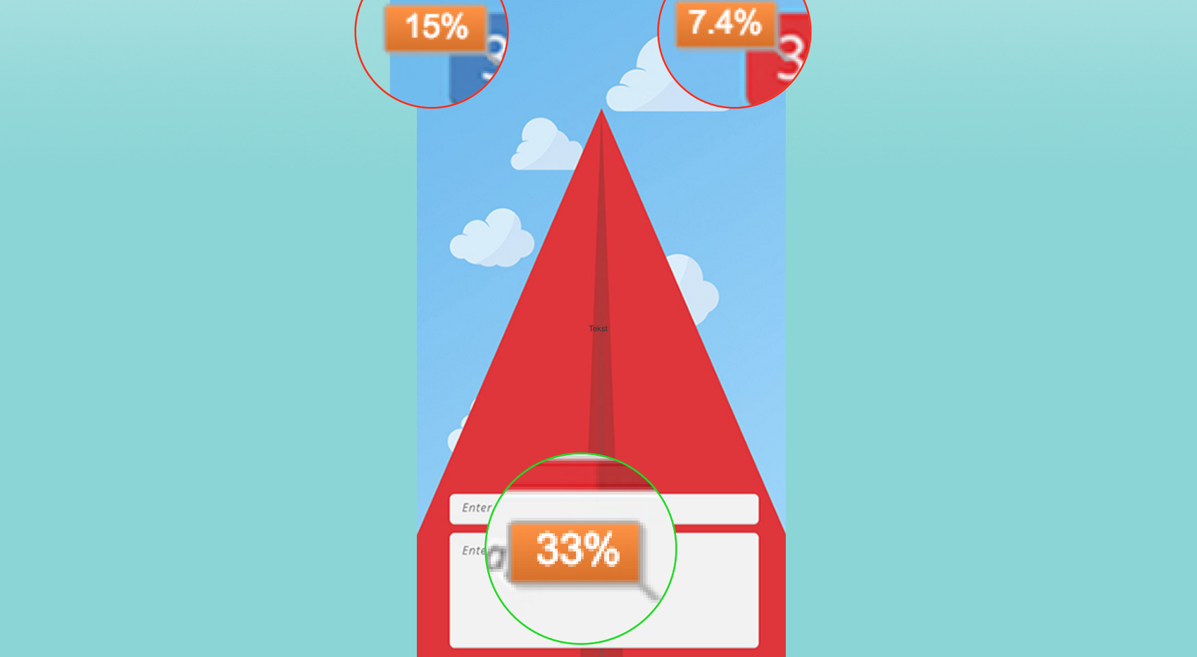
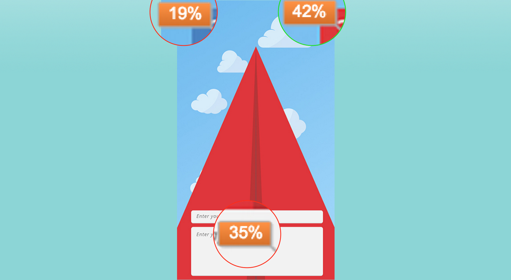
In the screen shot on the left, you see that 33% of the people click on the right area to compose a new message. 22.4% of the people click wrong, and the other 44.6% have left the page without continuing the test.
Smart Mobile - Research
Published on January 6, 2016
Marco Lemmens

Wouter Noij
 Domain manager
When talking about user experience you have to give the users the best usability. There are three main factors at hand when talking about this issue.
First of and foremost, the effectiveness. What this means is that the user gets what he wants to do. For example getting your cup of coffee from a machine. Simply put, does it work?
The second main element when creating the best usability is the efficiency. What process is the user going through when wanting to achieve his or her goals? Simply put, is it easy?
The third and last key element is the satisfaction of the usability. Is the experience going smooth and is it as naturally expected.
To reach the user with these three points is a hard job to do. To make the gap between user and good experience is something experts do by using storytelling. This technique is done with almost every great brand or product all over the world. How to make something more unforgettable or less boring other than a great story to go with it.
All these factors are very hard to get right for every individual person. All people are different and every story or experience will be unique. When we think about this app, the situation that the user is in will change the user experience. A great simple example of this difference is when buying a hot cup of chocolate milk in the summer or an ice-cream cone in the winter. Something tells us that this just doesn’t happen. Our surroundings change our behavior.
So with all these input of different things in order to make an unforgettable experience we have to give the users something of all that.
In the screen shot on the left, you see that 33% of the people click on the right area to compose a new message. 22.4% of the people click wrong, and the other 44.6% have left the page without continuing the test.
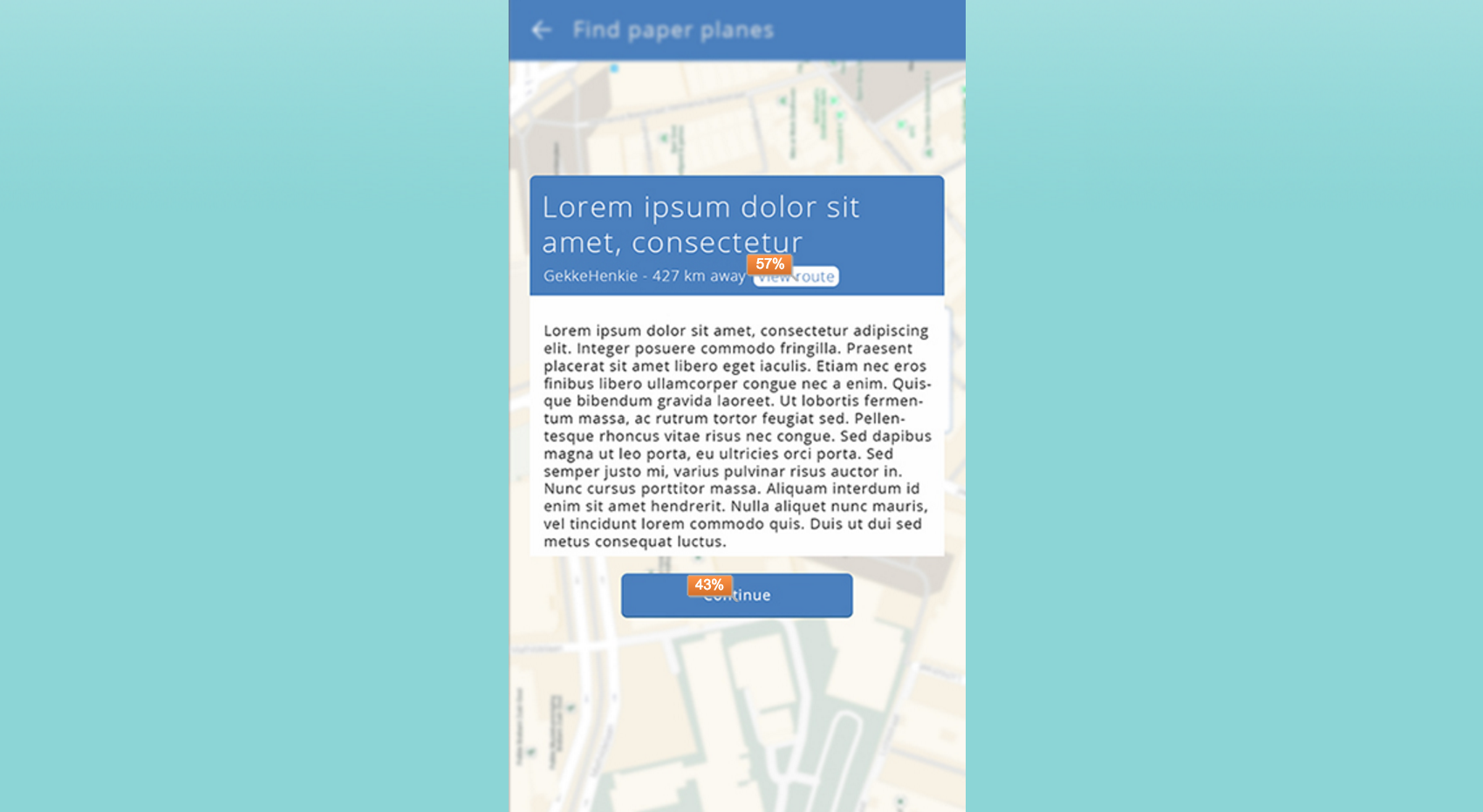
Again, you can see that these results are quite impressive. Most people click right the first time, on the top-right button. 4% of the people left during this screen.
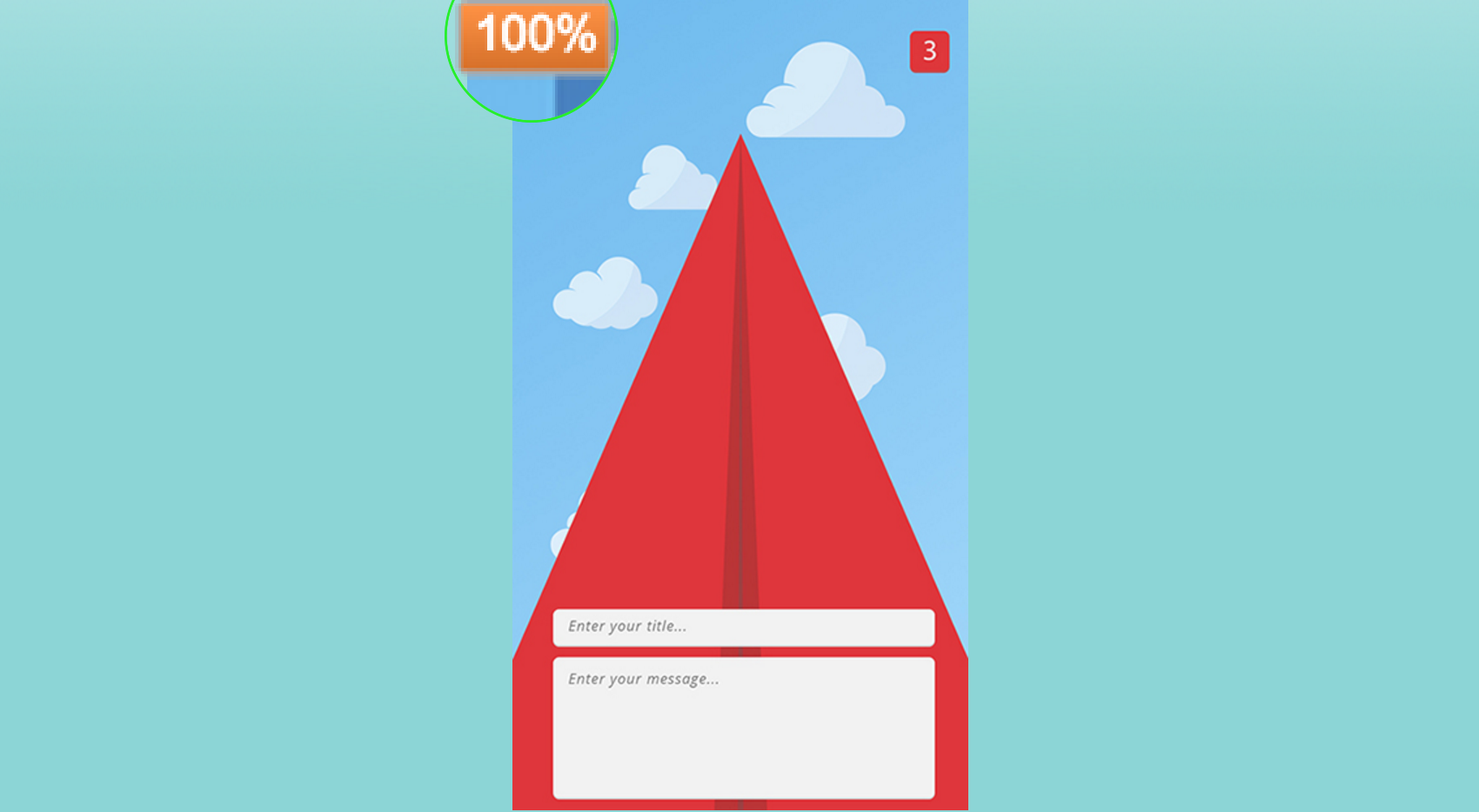
As you can see, everyone who came this far clicked on the right button. This might has something to do with the order of the questions. When the user knows what all of the other buttons mean, they can fill in the rest. This proves that after one or two clicks, the user instantly suspects the action of the other buttons.